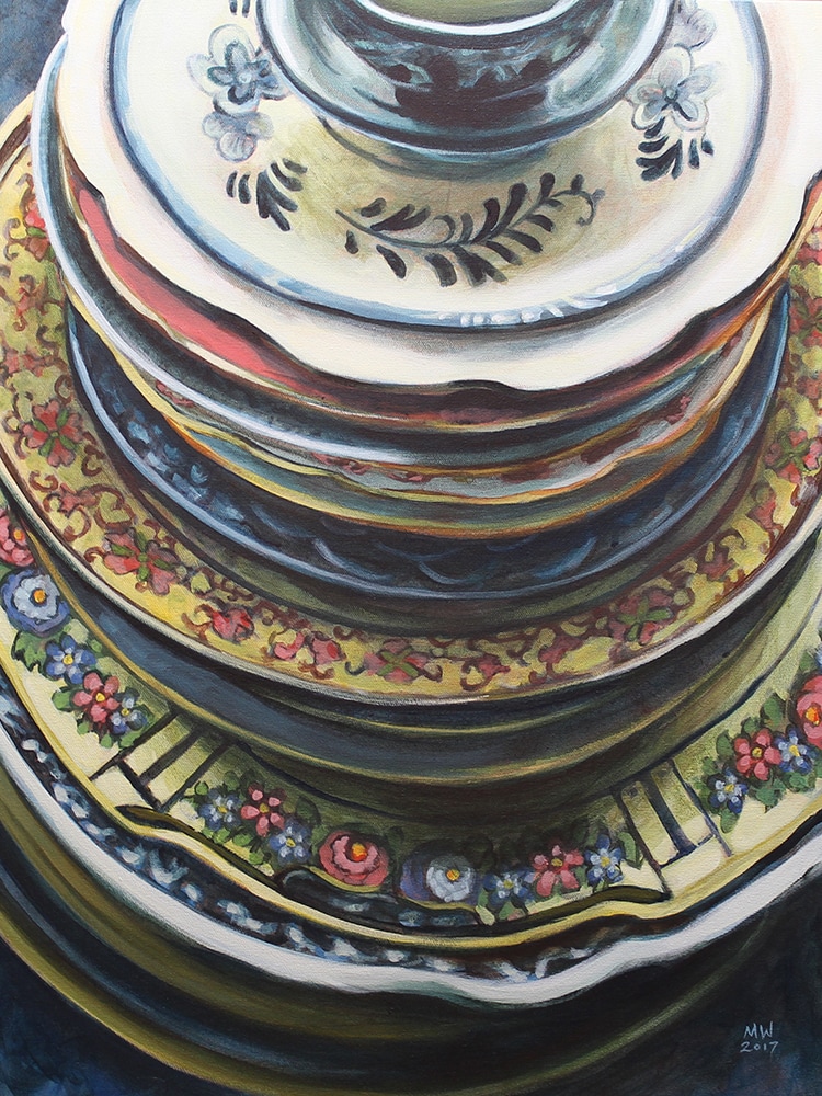
 Michelle Wiebe Tall Stack 18" x 24" Acrylic on Canvas 2017 I've been holding off on posting this piece for a while, but I am really excited to share it with you and announce that it has been selected for the Leighton Art Centre Juried Exhibition! I'm really stoked that they chose two pieces this year, the other piece is Turkish Cup. This piece was a challenge (in a good way) to paint. The patterns are particularly mind boggling on these plates. Luckily, I've painted most of these plates before, so it was very much like visiting with old friends. It was so much fun to stretch the range I could get with my limited palette. Hopefully my joy in painting this extends to you, the viewer! You can see both pieces from May 6th - June 18th at the Leighton Art Centre in Calgary. More information can be found here. This is an awesome show to take time to come see, there are some amazing artists connected to the Leighton Art Centre. 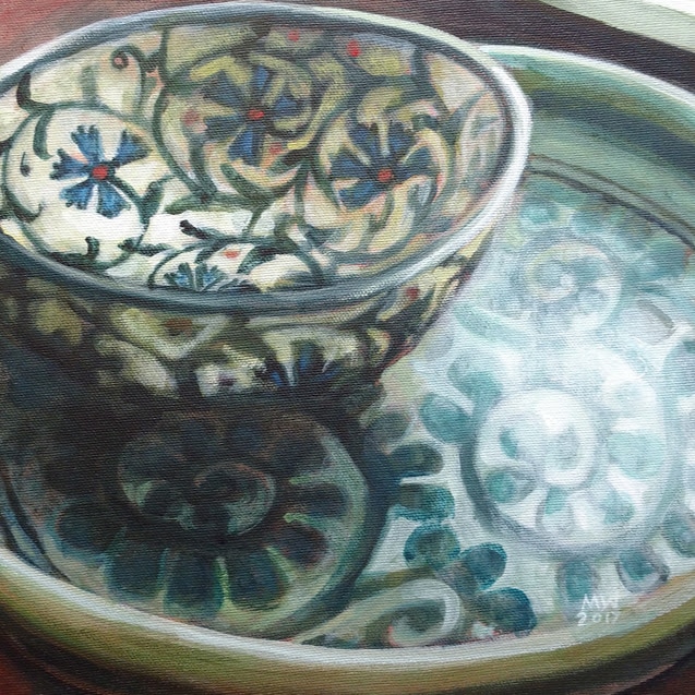 Michelle Wiebe Turkish Cup 10" x 10" Acrylic on Canvas 2017 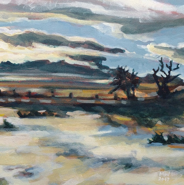 I've been feeling cooped up lately. A combination of bad winter roads and extreme windchill temperatures has kept me mostly housebound for the past week. One of my regular outings is with my dog where I tend to let my mind wander as I soak in the various colours that can be found in the piles of white snow everywhere.
This painting is from a reference shot I took at one of my all time favourite places, Glenbow Ranch Provincial Park. We moved partly to be a lot closer to this beautiful places like this and I am looking forward to nicer days where I can explore again. When I was looking for my next subject, this image struck me because of all the blues and golds found in the sky and the snow. It felt bright, windy and cold to me.  Michelle Wiebe Turkish Cup 10" x 10" Acrylic on Canvas 2017 I have a habit of collecting tiny little cups, bowls and plates on my travels. If it has a hand painted pattern, I find it very hard to resist adding it to the odd sized stacks in my cupboard. Many of these things get used for tiny amounts of sauce or to hold pieces of a craft projects. I like that they they step in to be used in a variety of ways.
I don't think I've ever painted this little cup (or bowl?) before. I bought it in a market in Istanbul a few years ago. Although the walls look nice and sturdy, the glaze is fragile and chips easily. I unearthed it the other day in my art supplies where it was holding odd pieces of chalk. I decided I needed it out in the open so I could trace it's pattern and see the effects of different light hitting it. I gave it a new use, sitting near my chair where loose buttons and hair elastics land. It has brought me quiet joy in the past few weeks. As I have been pushing into this new series, I have realized that I have been craving pattern and technical detail. This piece was a tricky delight to paint all the light hitting the plate underneath my little cup. Phthalo blue has an unashamed starring role in this piece. I feel like I've embraced my flaws by using it so much! 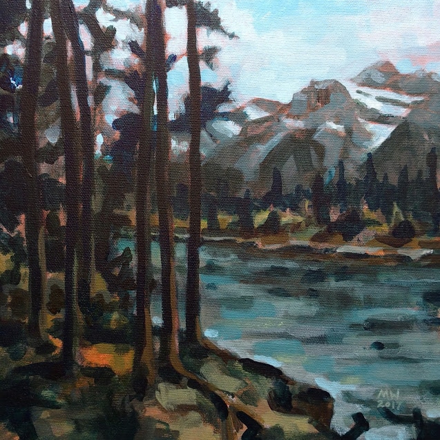 Michelle Wiebe River Edge 10" x 10" Acrylic on Canvas 2017 Winter has really settled in and a few days ago I found myself looking through my reference file for my next painting subject. All the pictures of crisp late summer mountain forests were calling to me. There is something magical about the greenish mountain waters - they seem somehow more ancient than the same river miles away on the flatland.
I took this picture a few months back up in Canmore, on the path that flanks the Bow River. This was a fun family day because we took our kids and our dog, Ivy, on this path. The dog was entertaining to watch as she crashed around the bushes trying to find the resident elk that were grazing nearby. I am still enjoying this limited palette. I did use phthalo blue again, but I've learned to accept my rule bending. I have really been challenged in a good way to really pay attention to the values in each piece. I'm continually struck by the harmony this small choice of colours brings - not only to each piece but to the whole series. 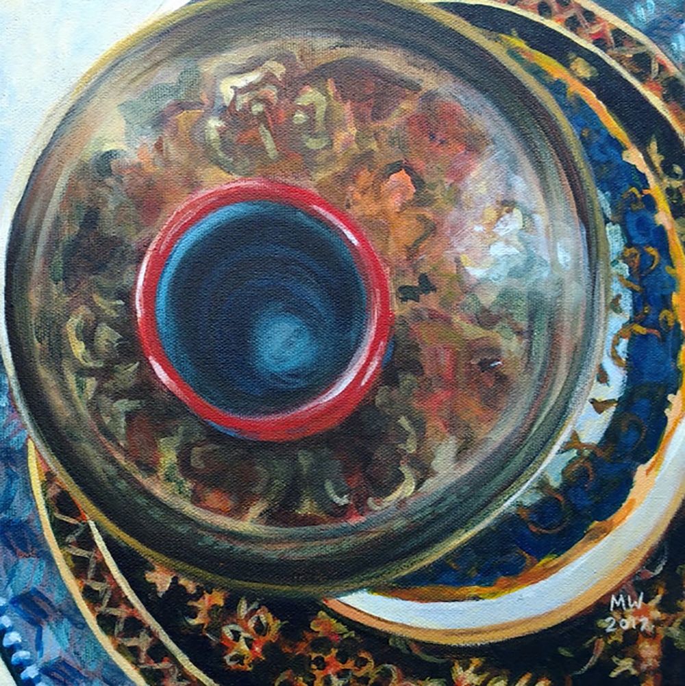 Michelle Wiebe Patterns in Gold 10" x 10" Acrylic on Canvas 2017 I have been in the mood for something technically challenging and this painting was just what I needed. Elliptical lines, highly detailed patterns and inky blacks were all things I wrestled to solve within this piece.
I will admit, I cheated a little on my limited palette. I have also decided that it is okay within this series to have one additional colour per painting if needed. I was fighting to blend some deeper shades using cobalt blue, cadmium red and burnt umber but they were not taking me where I wanted to go. I was resorting to thin washes to build up a black colour and I wanted to apply paint quicker and thicker. I fell back on a small smudge of phthalo blue to push everything darker. I was trying to avoid such a dominant blue (my over reliance on phthalo blue was one of the reasons why I stripped my palette black – it is too easy for it to take over once you start tinting it). This works and I still feel like this painting is feeling balanced. The phthalo blue is like the occasional treat on a diet – one colour in a painting won’t ruin all your hard work everywhere else. Besides - it’s something to maintain sanity, like a nice piece of chocolate! 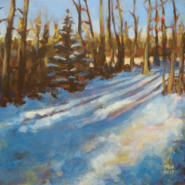 Long Shadows 10" x 10" Acrylic on Canvas 2017 It feels good to post something different. This is the first completed piece using my limited palette. It is bright and fresh and blue, but not too bright, too fresh, too blue. It feels balanced.
I've been really inspired by the trail system by our new house. In a matter of minutes one can get swallowed into the trees and loose track of civilization. Every day I walk these paths with my dog and lately I've looked forward to the soft stillness. The light has been lasting a little longer late in the afternoon. That magic hour in January has grand, long stretched out shadows because the sun is so low in the sky. I hope this painting reflects that. I want people to feel that cold crunch of snow underfoot and feel the silence. .  Things have been busy lately. One of the things I am working on is a series of paintings on my newly minted Wall of Shame. For those of you unfamiliar with my strangely titled work space, I like to display a row of blank canvasses on a wall that I can see frequently. The sight of those empty canvasses is enough to shame me into finishing them... hence the name.
Over the holidays, I was dragging my feet to get started on a series of work that are solely drafted by me. I realized I needed something compelling to get me going. After taking stock of what was lacking and I realized I needed some boundaries. Taking my cue from how people typically feel in the beginning of January, I decided to put myself on a bit of a diet. Over the years, flashy tubes of paints have been making their home more and more in my studio. While I love colour, I feel like I’ve been seduced with vibrant rainbows, living in a place where the hue saturation is always set to the loudest volume. This is where my diet from colour comes in – my palette cleanse. When I first learned to paint, we were restricted to a limited palette for years and years, mixing everything as close as we could with only a small choice of colour. I am very thankful for those years because I am pretty accurate when forced into it. My latest studio work will be a return to my roots, executed with a 5 tube palette of yellow, red, blue, umber and white. I’m still tweaking the exact hues and I may experiment with an even more limited palette later on, but for now this works. As I’ve been working like this for the past couple weeks, already I’m feeling refreshed. Having to pay closer attention to the values, stretching myself to mix greys that aren’t too muddy and spending more time composing the layout are all benefitting my work. I just booked a show at the Cochrane Ranchehouse in March where I plan to debut some of these pieces. My work outside the studio is not necessarily going to follow those rules. This weekend, I am honoured to be painting live at the Airdrie Mayor’s Night of the Arts (tickets available here) and I might be sneaking some tubes of green and violet with me! |
AuthorMichelle Wiebe Categories
All
Archives
April 2024
|
 RSS Feed