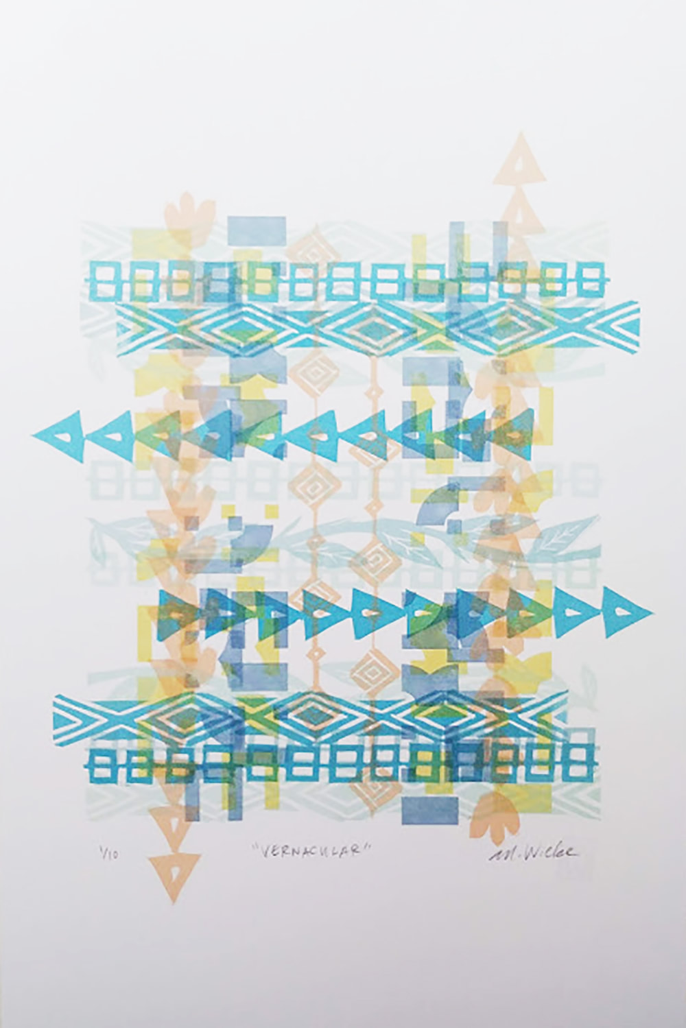
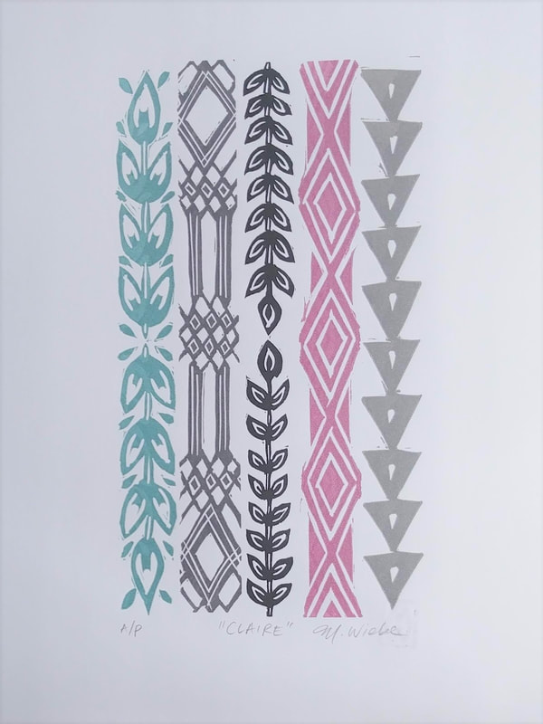
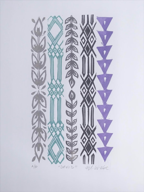
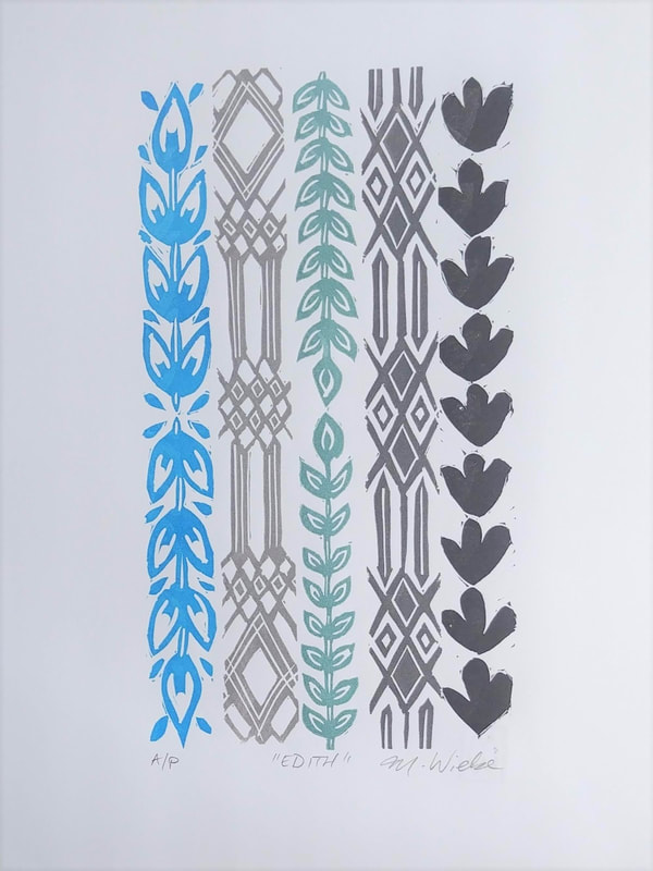
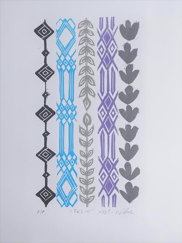
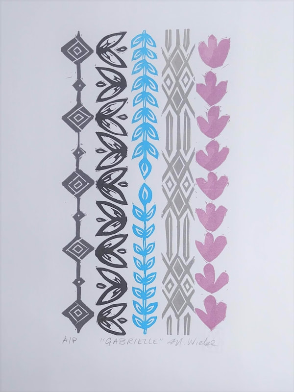
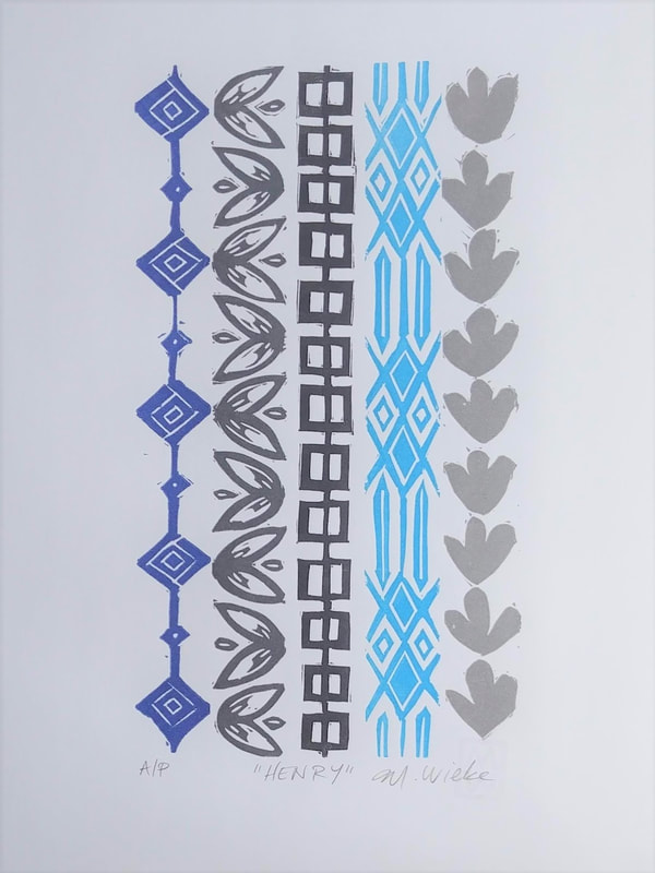
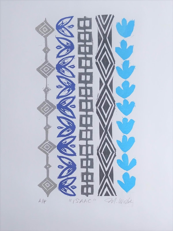
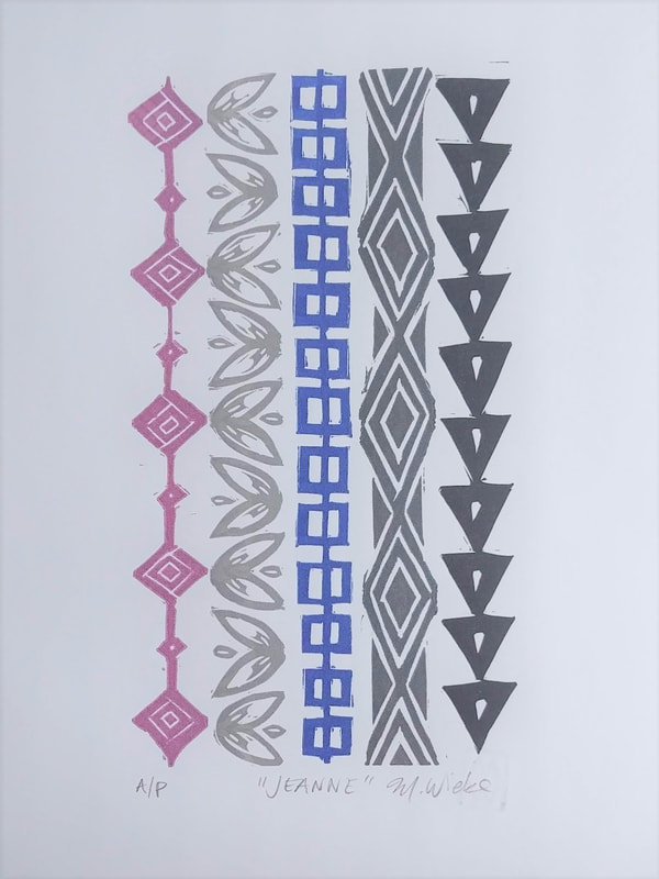
 Vernacular 12" x 18" Ink on Paper 2020 Michelle Wiebe With the new directions my work has been taking lately mixed in with headlines talking about equality, I have been learning new things about my art and myself. There has been a close examination of these issues through the lens of being a woman, from having Indigenous heritage, from having interests that are predominantly male centric, from having chronic illness, and from a lack of institutional qualifications. A lot of who I am is just how I was born; I did not have the option to pick and choose my traits or much of my situation. For a long time, I have regretted that I rarely fit neatly into institutions and established systems - my interests or background do not always dovetail nicely with the existing framework. With the exception of people on the inside with generous hearts taking me at face value and extending a hand of invitation, I find a lot of what I am interested in has been subject to knowledge gatekeepers or old fashioned notions of “it’s always been done this way” without the possibility of exploring the options. 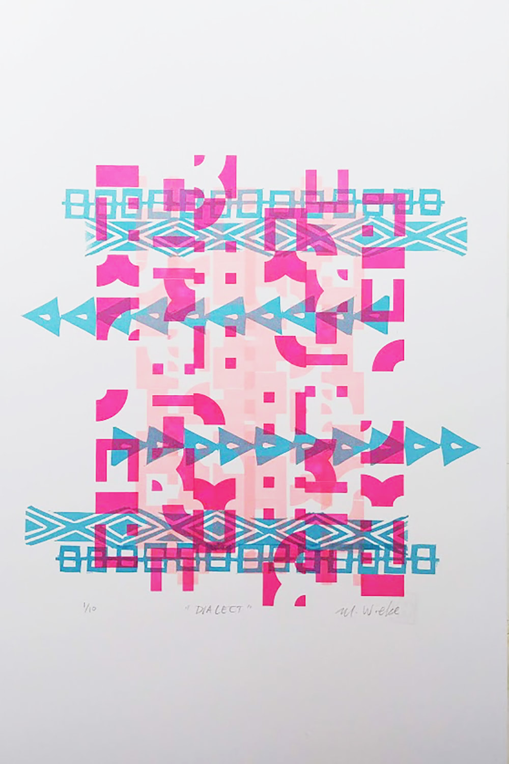 Dialect 12" x 18" Ink on Paper 2020 Michelle Wiebe Recently, I have been thinking about how I contribute even if I do not often have a set place at the table, the table being a metaphor for the way the art world has typically run. Slowly it has been dawning on me that my job with my art and as an instructor has been increasingly about building a new table. It is not refined table, just something makeshift. Like someone in their first apartment, the substance on this table can be meagre at times too – I have limits on what I can offer. The beauty of constructing it though is that everyone is welcome. Personally, I am often far more interested in who has never been to the table and why they want to be there. Yes, pull up a chair, you are welcome at this table. Another thing I like about this table, is while I might make a space for it, or put the bare framework together, I do not own it. This table can grow and shift as more people come to it and contribute their thoughts and ideas. A table like this lends itself to a potluck approach, the viewer or the student brings something as well and it adds more choice delicacies to sample. I recognize that there are other new tables being built – some of these might suit some tastes or dietary needs better. This is good. There is also the possibility of extending or joining tables down the road, should there be more space required. 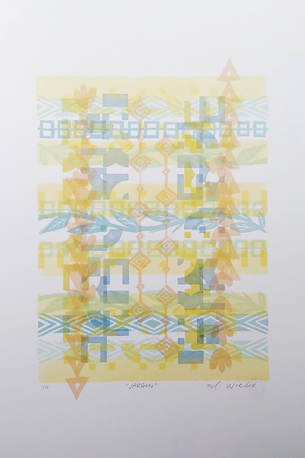 Jargon 12" x 18" Ink on Paper 2020 Michelle Wiebe With my latest work, a lot of it explores this sense of having no place to properly belong; severed ties missed connections and the feeling of being set adrift through policies and predominant attitudes. I know that I am not alone in this, so it felt like time to share where I am at with the hopes of others being encouraged to speak up about their journey. With teaching, there is a reason why I love introduction or basic skills-oriented sessions. The act of empowering someone to finally express their creative thoughts and discover their potential puts wind in my sails like very few things on this earth. Now though, my focus has been putting together a little table, set with my artwork, my classes and most importantly, my time. Please come and have a seat if you want or if the other tables do not have room for you – I am happy to see you here. * A note about the artwork, This is what I've been loosely calling my Protest Poster series (this series is unfinished as I don't have access to the studio at Alberta Printmakers to use the Vandercook press due to COVID-19.) These are exploring ideas of lost culture and language. Broken letterforms (by using P22 Blox, a fragmented typeface) and signifiers (the bandolier blocks) that don't have the full scope of meaning and are layered and printed to create a picture of chaos and scattered thoughts. These are printed on Domtar Cougar 130lb paper in white and are limited editions of ten. 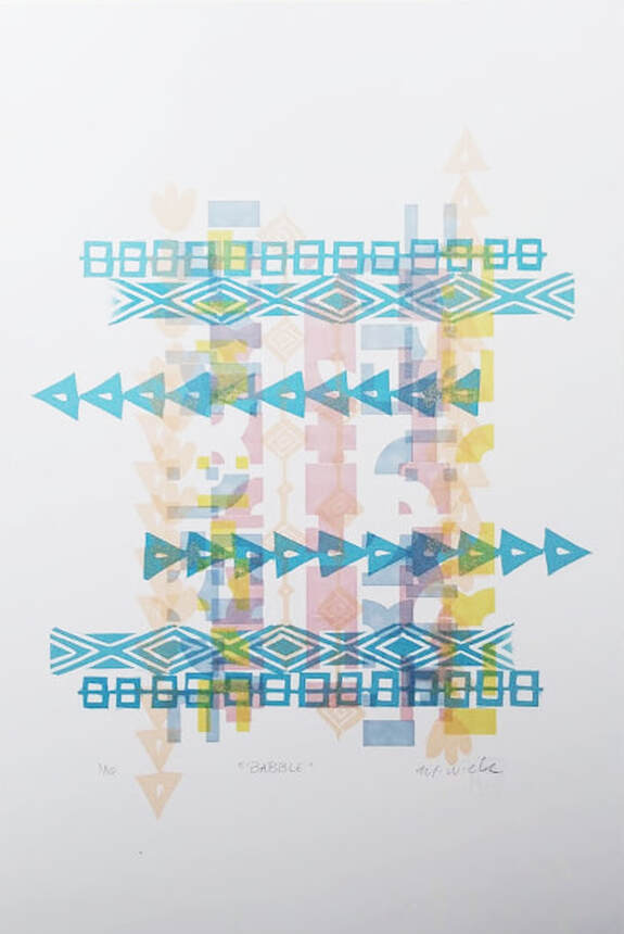 Babble 12" x 18" Ink on Paper 2020 Michelle Wiebe 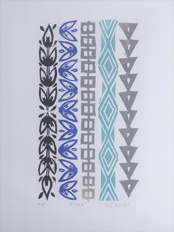 "Anna" 9" x 12" Ink on Paper 2020 Michelle Wiebe I have been working with a growing collection of hand carved linoleum blocks since January. They are unique for a few reasons. First is their custom cut dimension of 1” x 9” – I refer to them in my notes as the ‘long blocks” when planning. Second is their distilled subject matter, an interpretation of 19th century Anishinaabe beadwork patterns used for the creation of bandolier bags – a popular trade item with the settlers from overseas. The initial designs of this decorative item being modelled from ammunition bags from Europe. Finally, they are mounted to be what is referred to as “type high” (.918”) so that I can lock them into a printing press and produce many copies cleanly and efficiently using my vintage Chandler and Price platen press. I wanted to be restrained with my usual inclination towards perfection. I deliberately left carved marks in place and the occasional quirk in ink application (as long as it was consistent within the edition). These lino blocks were meant to feel handmade and imperfect. My current project, the Sibling Series, was born from a friend’s observation that it would be interesting to see the blocks printed without any overlap. Until that conversation, I had not considered this possibility of starkly presenting each of the blocks for viewers to evaluate on their own. Up until that point, I had been burying and layering with many components obscured, which felt comfortable to me. I planned out a series which would be printed in tandem all at the same time. The concept was to use the long blocks to symbolize traits, 5 blocks used in each piece. They were printed so that no two pieces has the same combination of blocks or the same combination of colours. This is to reflect how our ancestry comes out genetically. Each piece in the series resembles each other closely, much like a family. To reflect that French settlers were encouraged to marry within First Nation communities, I decided to name each piece in this series with a common name from 19th Century French communities. Another nod to mixed heritage. 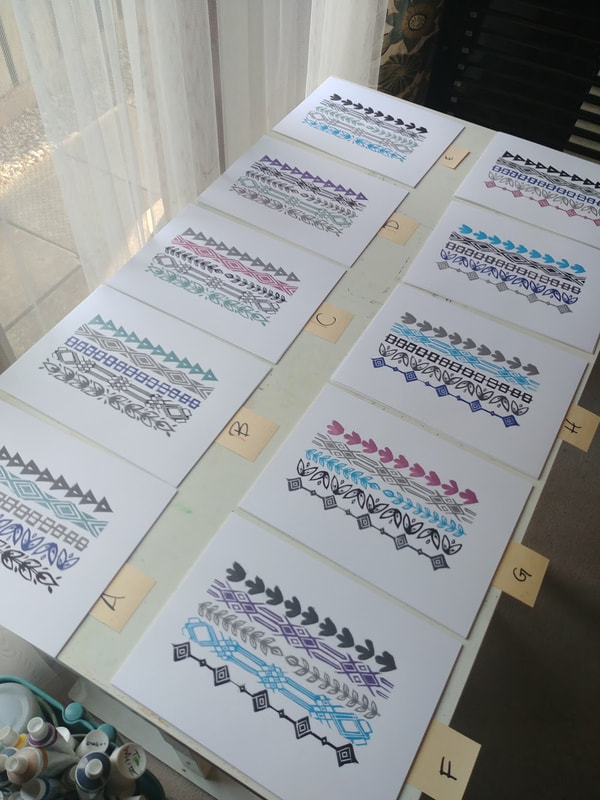 Keeping the prints organized through this process was very necessary. 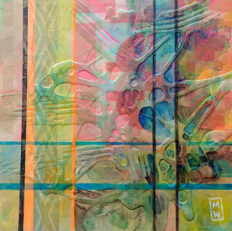 Vestigial 6" x 6" Mixed Media on Cradled Panel 2020 Michelle Wiebe Lately, I have been thinking a lot about my family heritage and reflecting on what that means with regards to our genetic make-up all the way to what it means to be a part of community. Some of you may have noticed a shift in my recent work. On the surface, these pieces began their journey as paper being fed through a printing press. As they rotated through, they made contact with various arrangements of linocut blocks. Each colour printed is a separate pass through the press. A lot of joy went into mixing transparent inks with just a hint of pigment, so as to allow the layers to influence and change each other – another way to express this jumble of genetics we possess from the start that cause us to prefer or not prefer elements of the world around us. Different branches of the family tree juxtaposed in unique ways. Once the printing was complete and the paper was dry, the pieces were then mounted on cradled panels to give them structure for the subsequent layers of acrylic texture and paint that were then applied. These layers speak to life situations and experience that grow and shape us, taking those original genetics and deeply influencing how one appears and reacts, enhancing some features while obscuring others. 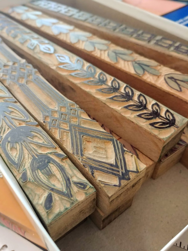 My growing collection of long hand carved linoleum blocks, used for printing this new series. So far, I’ve only talked about family in general terms, these pieces could speak to any family situation. Ones filled with joy and support, others with distance and regret – they cover the spectrum of human connectivity. This series is also deeply personal as well, the linoleum blocks themselves tell their own story, in some ways too close and revealing yet equally distant and covered in dense fog. My story is not so different for many Canadians – it’s a bit like living in a cultural mezzanine level. Not quite Anglo-Saxon white, not quite Indigenous either. There is damage to our family tree that has never really been fully examined or repaired. Growing up, we have always been proud of our First Nations ancestry but have been isolated from it so long that there are very few fragments to connect to. Some of this is physical distance, some of this is from the cultural climate. While there is a desire to connect in this way, there is the reality that this could be potentially awkward for all involved. 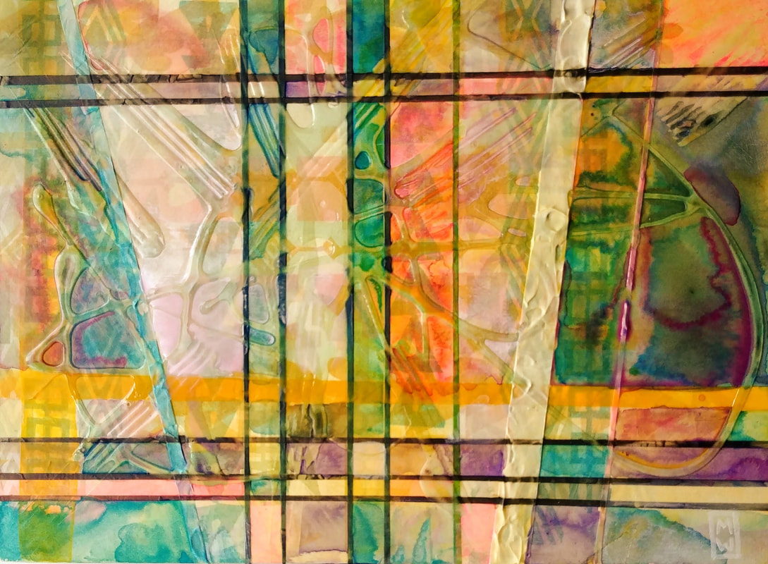 Fragment 9" x 12" Mixed Media on Cradled Panel 2020 Michelle Wiebe 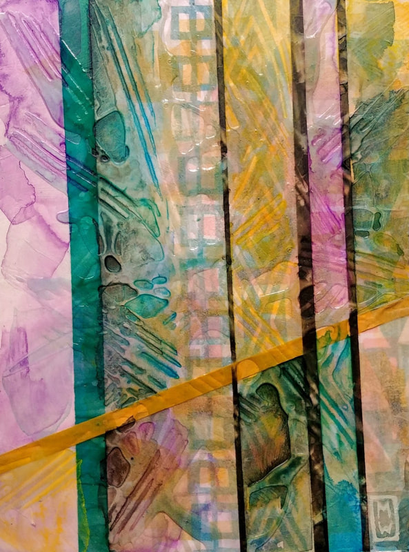 Inherent 6" x 8" Mixed Media on Cradled Panel 2020 Michelle Wiebe 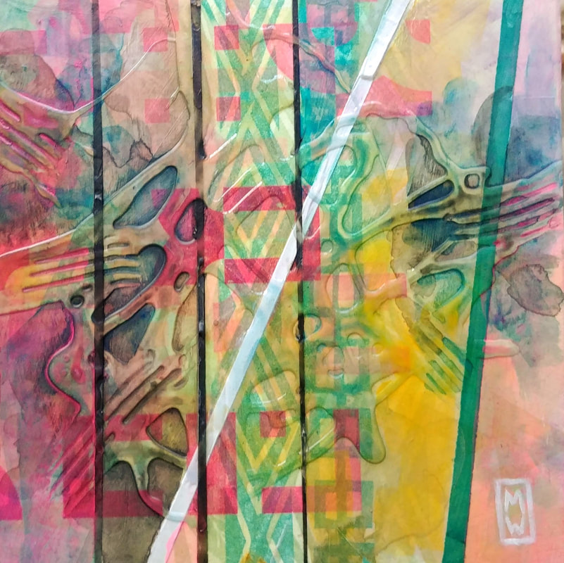 Lineage 6" x 6" Mixed Media on Cradled Panel 2020 Michelle Wiebe  A new tool for me : an 11/1 Pfeil U gouge. I have an even tinier one on order. I have stalled on writing this year end/beginning blog post. I think because, for a while I was thinking about the past decade and it really tripped me up. Long story short, I have not made the gains in the past 10 years that I would have wanted for myself. In fact, I'm in a totally different head space now than I was 10 years ago. So, in order to move this blog post forward, forget the past decade, that post would have been too whiny. Back to 2019 - what an unexpectedly good year. Here are some reasons why: 1. St. Louis is an amazing city and the Ladies of Letterpress Conference was filled to the brim with fantastic people, big machines and thousands of things to learn. I want to try my best to return this year. I feel like I only brushed the surface of potential those days can hold. I came home with many treasures and ideas that will keep me out of trouble for the bulk of 2020. I suspect. 2. I returned to my role at Heritage Park as a Trades Interpreter for the Strathmore Standard Newspaper Office. This was meaningful in a multitude of ways - working and learning on the letterpress equipment, broadening my historical knowledge of printing and most importantly the friendships that have come out of my time there. Plus, knowing that pictures of me wearing my Edwardian costume, clicking away on the Linotype are being posted to random tourist social media accounts worldwide is highly entertaining. 3. After taking a break during the year I was recovering, I resumed my membership at Alberta Printmakers and found lots of ways to become involved - serving on the Board, printing manhole covers, demonstrating linocut printmaking and teaching a Letterpress class! They won't be able to get rid of me in 2020, I have my eyes set on using their sweet Vandercook a whole lot more in the new year. 4. Speaking of venues, along with those mentioned above, I need a special shout out to Bluerock Gallery in Black Diamond for not only carrying my work, but hosting a pop-up for me at Christmas. I also need to say thanks to Inglewood Art Supplies and Studio for having me in to teach so often and for being so flexible and fun to work with. 5. I am no longer in "recovery mode" - while I am not the same person I was a few years ago, I think I am far stronger and functional than I have been for many years. The small deficits that I have noticed are being worked on how to work around them (and that in itself has been a fun challenge to meet head on). Add to this that my family has had a good year without too many challenges as well - life truly is good. Of course there are more things to celebrate, but these are the big things that come to mind. So what is ahead for the coming year? More of the same, but with more refinement. I'm looking forward to teaching more, making more and sharing more in the months ahead. I am really wanting to push myself again (something that has been hard for a few years). I've been looking at a lot of art, reading lots and talking through some exciting projects. Hopefully 2020 will an even more exciting year! 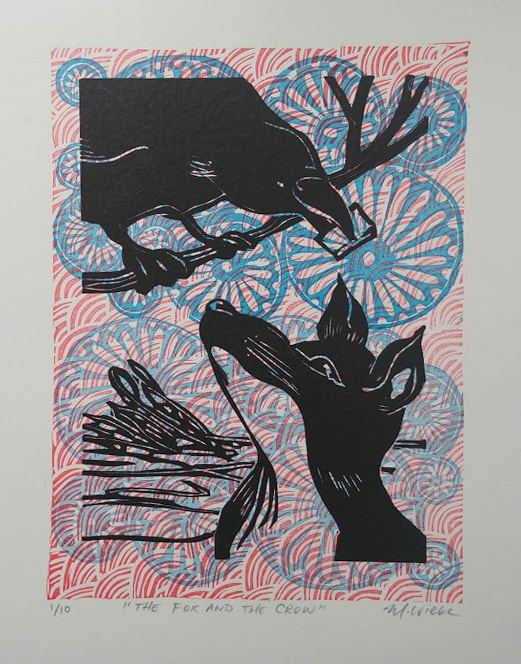 I have very much enjoyed becoming a more active member with Alberta Printmakers this year. They are comprised of amazing artists and supporters who are super inclusive and encouraging. One of their yearly fundraising efforts is the Not So Mini Print Exchange and Exhibition. It is an international call and artists submit an edition of 10 prints. Of that edition, 8 prints get given to other artists and 2 go up for auction with the proceeds going to fund further A/P projects. My piece, The Fox and the Crow, was a return visit to an old theme that has been popping up in my work for about a decade. It's based off of a fable by Aesop - in it a crow has a tasty morsel of cheese in her beak. A sly fox decides to convince the crow that her voice is beautiful and that he wants her to sing. As she starts to caw and croak, the cheese drops to the ground and the fox runs away with the cheese. This has always been interpreted by me as a stark warning about flattery and other wasted words. I have a hard time receiving compliments, I tend to be very awkward and uncomfortable when this happens. This is a long standing thing - hence the reoccurring fox and crow theme that I relate to on a deeper level. This strangeness about compliments was recently pointed out to me and I started to process a little bit about why it is hard to hear those things (haven't totally figured that out). I do like receiving warm feedback (especially from those that I really respect their opinions) and I decided it was time to put the Fox and Crow theme to rest. It was the subject of a print I did a long time ago that was rushed and I was dissatisfied with the end result. This version I am much happier with. I printed it using 3 different blocks (the large red rectangle with scalloped pattern, the blue circle/floral blocks (used twice) and the final fox and crow block. I played around on my Chandler & Price treadle letterpress with very diluted pigment and tried my best to get nice registration and clean edges. It turned out well. I agonized over the composition for quite some time because I couldn't picture the placement very easily in my head - but at the end, I think it reads well. I feel like I am making slow art these days. Hopefully the flavours are that much more developed because of it. I also feel like I'm starting to make peace with some of my hesitations surrounding kind words about my work. Come and check it out and all the other amazing pieces at: Not So Mini Exhibition Alberta Printmakers December 6th - 21st, 2019 Find out more here.  So I have a confession of sorts. I've recently come to the slow realization that despite having almost two years to recover and working very diligently on my artwork, I still have a very difficult time visualizing what it is I am wanting to make. What do I mean by that? Well, if you asked me to close my eyes and picture a chair, I could do that pretty easily. If you ask me to make you a picture featuring a chair I literally draw a blank. Nothing. Now, resist temptation to chime in with "me too! I never know what to draw or where to start!" That's not really what I'm talking about... I have this hard to describe loss of not really being able to do what I once was very good at which is this sequence of "here is the request" then "explosion of images in my head" then "rework images in my head" then do a sketch. Now it's more like "here is the request" then... crickets.  So, why I am sharing this? Honestly, the idea of this is super interesting to me - how and why do I make art then? How long did I go on making things not realizing that the ability to visualize never really returned? Truth be had, I really avoided "making art" as much as possible. Or I stuck to tried and true things like representational paintings. I got super good at carving patterns on linoleum because I couldn't decide on anything to depict. So I'd carve lines. Or circles. The blocks started piling up.  It wasn't until I tried to make something specific that I completely stalled out. Since I had imposed a deadline for myself to abide by, I had to figure out how to make something from nothing. I learned a few things about making flights of fancy materialize along the way. . 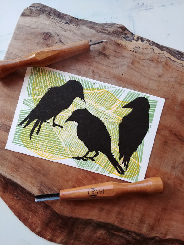 Words help There is something about how my brain is re-wired that words still play a very, very strong role in how things do or do not get done. It was over coffee with a friend talking about my side project where it really started to dawn on me that talking ideas = half formed visuals in my head. Writing half formed visuals down and then pinning them to a style, time period or medium = slightly more formed ideas. Repeat until the artwork emerges. Words somehow resemble having a tiny flashlight in the woods at night. They illuminate the steps ahead but I cannot see the destination (or the wolves lurking in the inky darkness) 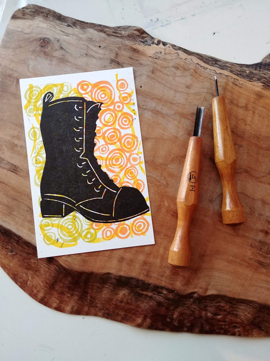 This is not all bad. Since I've realized this deficit still very much exists for me (and might be part of my new normal) I have noticed that my artwork is more considered. Gone are the days of dashing off spur of the moment paintings. This has been replaced with informally collaborating through offhand conversations. Talking out an idea seems to lead to imagery. Slowing down like this allows me to really consider things like composition, colour choices, subject, style - the list goes on and on. Just because something used to be easy, doesn't mean that it was better. 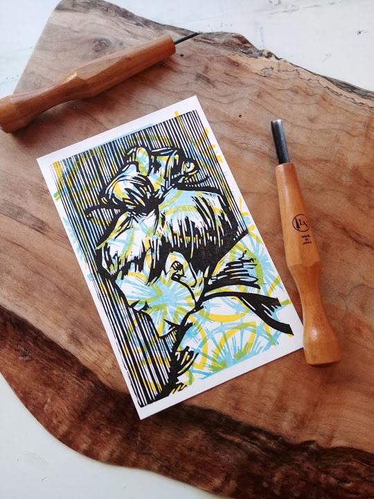 Anyways, all this to say that since that discovery, I've been tinkering with all sorts of ideas and making new things. Plus, I've learned that if the visualization isn't happening I have to keep busy anyways. Sometimes it is prep work, sometimes it is digging out an old half finished project, sometimes it is just reading or drawing (which still remains a spontaneous arena for me). Productive procrastination is a thing for me these days. 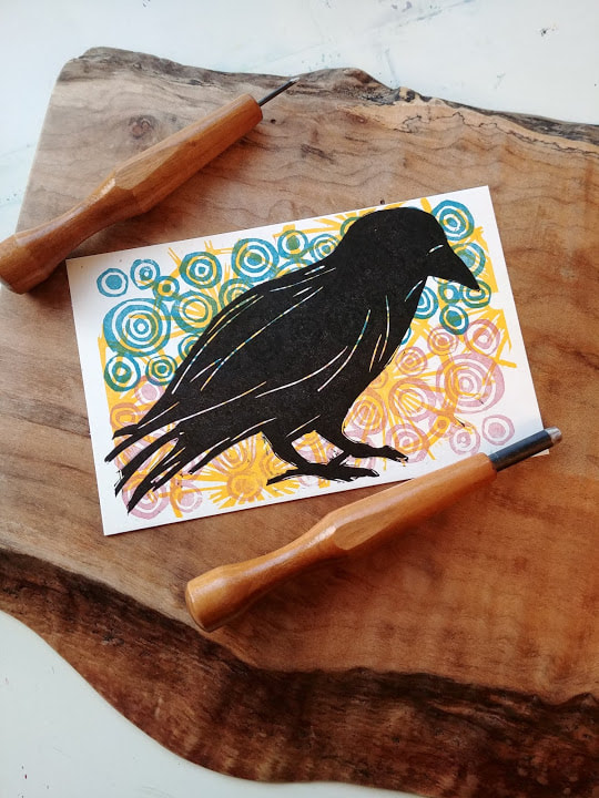 I've also learned that having deadlines really help (real or imagined) - I'm quite excited that a lot of the letterpress notebooks and postcards that I've sprinkled throughout my post are destined for a Pop-Up Market at Bluerock Gallery on November 30th! Since I was bringing my little press with me, I wanted to have a lot of freshly printed items that showcased letterpress and linocut!
 My trusty pal, Kelsey with some Christmas cards we made together. I am really looking forward to the events that are coming up in the next few weeks. All my favourite things are here: painting, printmaking and letterpress! Christmas in the Country 2019 Leighton Art Centre, Calgary AB November 2, 2019 - November 10, 2019 I'm happy to have been selected to participate in the annual Christmas in the Country Art sale at the fabulous Leighton Art Centre. Over 2000 pieces of fine craft and unframed artworks by local artists will fill the museum and galleries of the historic Leighton home this November, Free parking, free admission & complimentary festive treats throughout both weekends. Spectacular Rocky Mountain views included! For more information visit here. Making Your Mark - Beginner and Intermediate Acrylic Painting Inglewood Art Supplies and Studio November 5th - December 3rd 2019 Tuesdays 6:30 pm - 8:30 pm Learn the basics of painting and start working on your masterpiece! Students will learn how choose their subject, prepare their canvas, apply paint with a variety of techniques, as well as troubleshoot problem areas. Students will take home a completed painting and the knowledge to develop their skills further on their own. Intermediate Students will be coached through individual projects and provided with more targeted feedback based on their goals for skill development. $30 Drop-In option available, For more information visit here. Print & Be Merry: Holiday Print Workshop Alberta Printmakers Wednesdays, November 20th and 27th 2019 6:30 pm - 8:30 pm (both evenings) Carve your own holiday linocut image and print it on a tabletop Kelsey letterpress! Over two sessions, students will learn the basics of linocut carving and printmaking, and use a tabletop letterpress to create one of a kind Christmas cards, tags and wrapping paper. Participants will leave with a variety of hand printed projects, their own carved blocks as well as the skill to practice at home using basic art materials. Members: $75 Non-members: $80 All materials provided, no experience necessary! For more information visit here. Bluerock Gallery Pop Up Market
Black Diamond, AB November 30th, 2019 10:00 am - 6:00 pm It will be so great to be back at Bluerock Gallery for a pop up market with my latest Letterpress ephemera on display as well as the soothing rattle and clink of my trusty travel companion - my Kelsey tabletop letterpress. I cannot express how much I love being a part of this gallery family - they have been so supportive of my journey into printing! It will be a merry day for sure! Come by to soak up all the art and to say hello! For more information visit here. 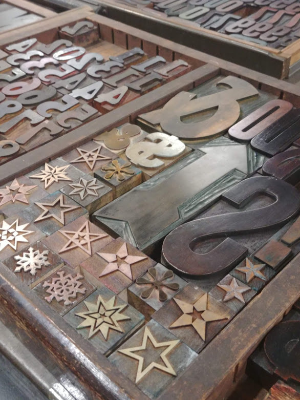 Random wood type ornaments I encountered at Central Print on my first day I feel like I have run out of words lately. After a recent whirlwind trip to St. Louis for the Ladies of Letterpress Conference it has been a little harder for me to gather all the things that I am thinking about and writing them into a concise blog post. Perhaps I'll soon be able to pull the string and take the brown paper off all the things I saw and learned while I was there. Thankfully I have had reasons to unpack aspects of this trip already as much of it pertains to my letterpress endeavors. 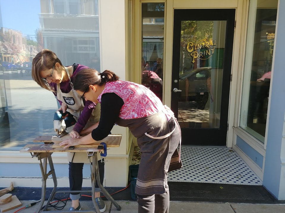 Me in my happy place outside of Central Print with power tools and a like minded friend! Recently I had the delight of buying next year's day timer, I have started filling in small dates here and there, the school calendar is added and all this has reminded me about the power of anticipation. I remember a Jewish friend of mine sharing with me years ago the concept of how Sabbath day of rest fits into their calendar. It is the high point in one's week - you spend three days preparing in anticipation of all the things needed for that day to be a complete rest and refilling. After it is over, you spend three days reflecting on the experience you had. Then the cycle repeats. 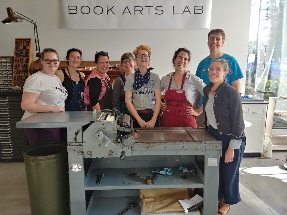 Collaborating with these people and with this collection of type was a highlight. My day timer is like that, in its more haphazard fashion. I have a fairly routine orbit of teaching, appointments and meetings rotating throughout my weeks. Anything slightly different that engages my senses tends to be savoured long before it arrives. Planning a special trip, going for a walk or a coffee with a friend, setting a time for a gallery hop sees a lot of anticipation beforehand. Afterwards the glow of those moments seems to light up something creatively within me and I have a bout of inspired studio time. By the time it starts to wane, I look towards the next bright item in my day timer (I don't make a lot of social appointments now that I think about it). As you can imagine, this conference was HIGHLY anticipated for quite some time.  Prowling through gardens and back streets in search of weeds to transform into ink From the moment I stepped off the plane to the moment I boarded to go home, I was busy and engaged. At times, my brain felt overloaded. A friend I made at the conference shared that she booked 3 or 4 days off after she got home. Her method allowed her to make space for all the things she learned and gave her a chance to play with some of the concepts she was getting a handle on. I managed to take one full day off just to blissfully experiment in the studio, and I will learn for next time to book off more.  Experimenting afterwards with some new tools I looked forward to this Ladies of Letterpress experience for a long time and now it is over, I need to look back perhaps even longer and see what I gleaned from it. Hopefully some more jewels will be placed in my calendar for when this glow starts to wane. 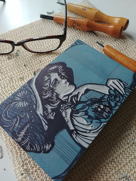 A few days ago I carved this portrait of Lily Elsie. Hoping to print it this week. Recently, I've taken up writing in my journal regularly again. After all my health issues last year, it dropped off my radar. In order to tame my scrawling cursive, I've been using a fountain pen which is far easier on my hands and seems to slow me down in a good way. As my cursive is improving I am noticing that the pleasure centres of my brain light up when I manage to write a long word with no breaks and with correct letter formation. It's the little things, folks. I am currently working on quite a few pieces, most of which have shows coming up where they will debut. This weekend I will be at Artsplace in Canmore for Pottery Palooza - my first time showing there! I have fresh work coming to Leighton Art Centre for the Clothesline Festival as well the fabulous Bluerock Gallery. I also have pieces that will be shown on the Mini Masterpiece wall at the Calgary Stampede. This is the first time I've participated in a Stampede art event, so I am very excited. This is also a very busy time for instructing - once the snow melts, the roads are far more reliable and classes fill up. Right now, I've been doing a Tuesday night Acrylic Class for beginner and intermediate students at Inglewood Art Supplies and I have quite a few workshops approaching there and at Leighton Art Centre. I keep getting questions about outdoor sketching classes and lino carving - there are a bunch posted here.  My favorite off hours street parking.
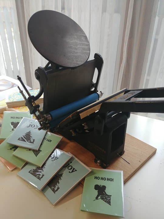
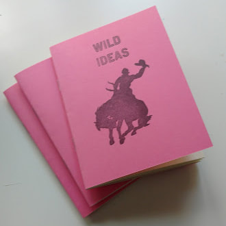
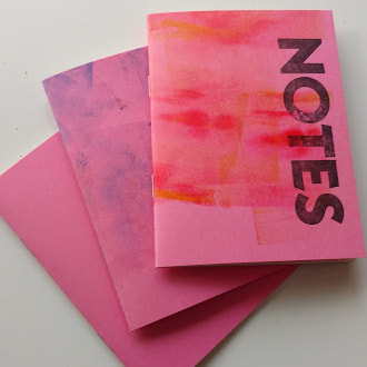
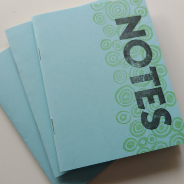
As if this wasn't enough busyness... I decided it was time to move from "recovery and rebuilding" mode and back into "learning and exploring" mode (a place that I am far happier to dwell in). I've been feeling so restless the past few months, needing to push my own boundaries and get out of my house. After skipping the 2018 season, I'm returning to Heritage Park part time as a Trades Interpreter at the Strathmore Standard. This is a wealth of letterpress knowledge that I'm looking forward to tapping into. Already this has opened some unexpected and interesting doors for me that I'll be sharing more about in the coming weeks. 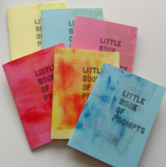 This is my popular 20 page booklet containing 20 drawing prompts. Cover is letterpress printed over ink rolled or linocut background. Interior is 24lb cream paper stock. It measures 4" x 5.5" Confession. Sometimes I make stuff based off of things people tell me they really wish they could use. Often this happens during workshops or classes I teach. The above books were born from a common frustration I've heard during my sketching classes. "I love drawing, but I never know what to draw." It is really easy to let a blank page intimidate you. It is also easy to feel overwhelmed by a big blank sketchbook. This little book is a two for one deal. It only has 20 pages and it only has twenty prompts. You could tuck this away in your backpack on a trip or you could sneak it into your purse and go to a coffee shop. Since it is only 20 pages, it is completely reasonable that you could finish this little book off over a Grande latte or a week at the beach. The prompts are simple and vague... they are flexible to the different kinds of environments you might be in. They are suitable for any age as well, so you could easily gift one to a drawing enthusiast who would get a kick out of it. 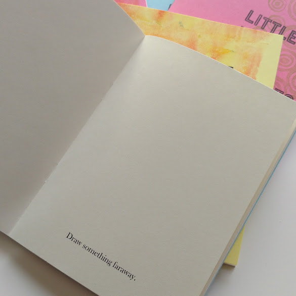 I'm not going to show you more - it'll ruin the spontaneity and surprise! This is a quick and loose kind of book, not a precious book. It is meant to be used as a conduit for your creativity to get you started (or restarted) and onto the next project. It is a means to an end. I mentioned it during my drawing class today and had quite a few who wanted more details. So here they are! If you want one for yourself, please message me here and I can send you a snapshot of available covers (all the interiors are the same at the moment). If you find one you like, I accept cash, paypal and EFT (we can figure that out via email) and for the next while, I will even mail it to you for free (Canada only - anywhere else, I can give you the cost in the email, one book is just a standard letter rate so very affordable to ship) Each book of prompts costs $11.00 CDN and is made by me! If you like the little sketchbook idea, but don't want the prompts, I also carry a variety of blank notebooks (same size, same paper stock, same number of pages) that have one of a kind covers as well. Same free shipping in Canada applies here, these ones are priced at $9.00 each. You can also find them in person at Bluerock Gallery in Black Diamond! |
AuthorMichelle Wiebe Categories
All
Archives
July 2024
|


 RSS Feed