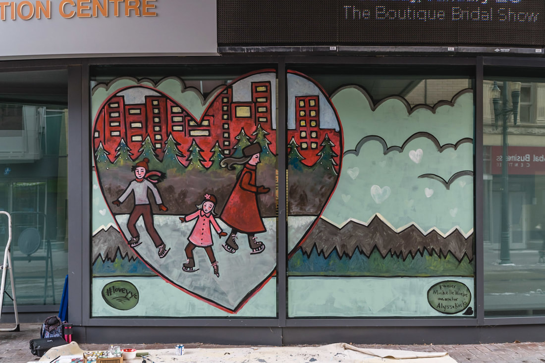
 "Heart of the City" at the Telus Convention Centre (Stephan Avenue by Glenbow Museum) Photographer: Kunikazu Kawashima for Buds of Buds I was so excited when I was selected to participate in the Northern Reflections Window Exhibition. I submitted a proposal to the Buds of Buds Artist Collective because this project had a special twist. Unlike typical painted windows (and Calgary has a long standing tradition of painted windows for the Stampede) this project was trying something different - Augmented Reality. The premise was that artists would be paired with animators to work with downtown businesses to develop a winter themed piece based on tradition or memories. The artist would paint the window and the animator would bring it to life through digital animation. I am always very curious about ways to marry old art forms with technology so this was very intriguing to me. Then viewer can tour the downtown core and see the augmented paintings and vote for the ones they love best. How it works is the painting is designed to have features (called image targets) that can be picked up by the software, similar to face recognition technology. We attended a workshop where we could see this in action and knew what things work better than others (ie, lots of clear outlines and shapes read better than muted pastels that are blended together). Once the painting is completed (on the outside of the window as opposed to the inside so that there is not a lot of glare to confuse the program) a photographer takes a high quality image to give to the animator. The animator then goes to work adding virtual elements to parts of the painting to bring more to the story and add interesting details. The final step is the animation is loaded onto a smart phone app called AUGLE (you can find it your app store for free) and the viewer holds their phone (with the app open) up to the paintings and the app sees the image targets and starts the animation as an overlay to the painting. It is really cool to see in action. 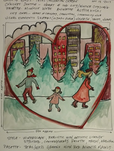 This is how a piece like this usually looks before it is painted. When you do a live piece or something painted on site, you only have one shot and usually a limited time span so planning is everything. Especially when you have to deal with the elements and are far from your studio. After attending the initial Buds of Buds workshop, there were a few steps before the painting could begin. The first one was to be paired with an animator - it my case it is the super talented Alyssa Koski. True story - I was emailed her name and it seemed so familiar (and I don't know any animators). I kept trying to remember where I had heard it before. Once I got a chance to sit down and have a proper look at her website, it was 2 seconds to realize how I knew her - I bought a piece of hers from the ACAD sale 2 years ago as a Christmas gift for my daughter! What a small world, needless to say my daughter (who loves that piece) thought I was MUCH cooler after I told her who I was working with! The next step was to meet with Alyssa and go over a document that we were given by the business. In our case, we were so excited when we realized our partner was the Telus Convention Centre! Wow! In the document, they were given some choices of what type of image they wanted, some key concepts that would fit their corporate/business identity and any requests they might have. We looked it over and talked through some ideas that could work collectively. One of the key elements was to bring winter memories and traditions to life, and we both agreed that a special and uniquely Canadian one was outdoor skating. I have very fond memories of family skating trips from when I was a little girl as well as city skating with my own children. It just so happens that right across the street from the Telus Convention Centre is Olympic Plaza - the only refrigerated outdoor ice surface in the City of Calgary! We started with the ice skaters and then looked to the Telus Convention Centre document for ways to connect it... one phrase that was mentioned to describe the centre was "Heart of Calgary" - the convention centre is a place that connects outsiders to Calgary and is an integral part of the downtown community. As Alyssa and I started planning our storybook style image, the framework of a huge heart to encapsulate the urban skaters came clear. We expanded the image outside of the heart with a snapshot of the Canadian Rockies that are found just outside the heart of Calgary. 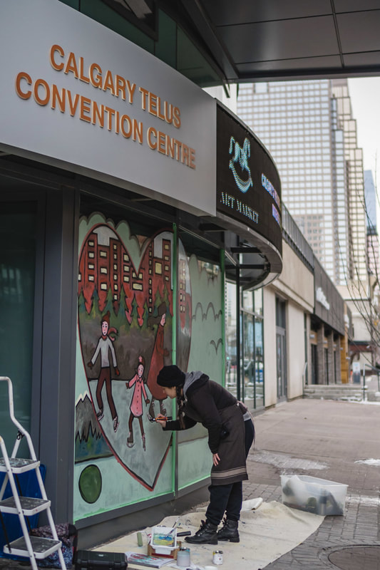 This gives you an idea of scale. I spent a lot of time climbing up my step ladder that day! Photographer: Kunikazu Kawashima for Buds of Buds The next step in the process was the actual painting. My hat goes off to the organizers at Buds of Buds who helped facilitate all the schedules for painters and businesses. Anyone who lives in Calgary can tell you what crazy winter weather patterns we have. We can change from -20*C to 10*C overnight. I'm sure they were glued to the weather channel the whole time the painters were scheduled! Not only did they have to be concerned for the health and safety of the painters (remember, we had to paint on the exterior windows in order for the AR technology to work) the paint itself behaves differently as the temperatures drop. I found this out first hand as the day went on and my paint got thicker and stickier by the end of my day when the sun started to dip. Thankfully, I had a beautiful day to work. My temperatures were hovering near the the 0*C mark the whole day and because everything was planned and prepared well, the entire process to set up, prep the window, paint and clean up took me around 6 hours. I didn't even need to crack open the Hot Paws that Buds of Buds gave me in case I needed them. I started out by drawing my image with a Molotow Paint Marker then using latex paint and a foam roller, I filled my major blocks of colour for the areas outside of the heart filled in. Once I had the foundation laid, I started on the detail work within the heart, starting with the buildings at the top. and working my way downwards. Near the end, I put my skaters in and then finished by redefining my initial black paint marker lines. Good thing I had time to spare on that part because it was right after I finished my skaters that I noticed the paint acting different due to the lower temperature. It was the right moment to wrap things up. 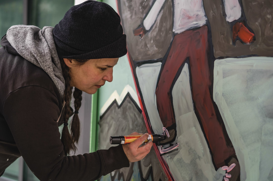 Dang I love those Molotow Paint Markers. Anyone who has seen me demo at Opus will verify this! Photo by: Kunikaza Kawashima for Buds of Buds Lastly, the photographed painting was forwarded to Alyssa who has indeed worked her magic! I was so delighted with her whimsical animation work (I'm hoping she posts it to her website so I can link to it) as of today, you can download the Augle app and come and see it for yourself. If you do, please remember to vote (hopefully for ours) as we are really wanting to see what kind of public engagement comes from this project. It is such a great community building concept from Buds of Buds and I would love to see it grow into a yearly event. Just think - even your teenagers would be interested in this family viewing opportunity since their phones are a key part of the process! Here are some key links: Augle App for Android Augle App for Iphone Buds of Buds Site for more Exhibition Information 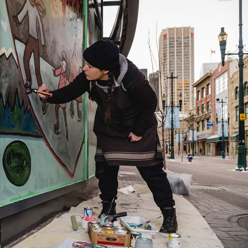 My favorite action shot from this project. Thank you so much Kunikaza Kawashima for your brilliant photographs! Northern Reflections Window Exhibit
Augmented Reality Display December 2017 My animation partner, Alyssa Koski, and I will be showcasing our piece, "Heart of the City", December 1st - 31st on the Stephen Ave windows of the Telus Convention Centre (right near the Glenbow Museum Entrance). Calgarians will have the unique opportunity to participate in and engage with an immersive art experience unlike any other. In partnership with Downtown Calgary, we will be debuting the first ever urban art gallery through a series of painted windows, called the Northern Reflections Window Exhibition that will incorporate Augmented Reality (AR) technology. The series will be painted by a variety of local artists and will stretch throughout Calgary’s downtown core, showcasing many participating local businesses and turning the city streets into a grand urban art-walk. See Buds of Buds for more information! 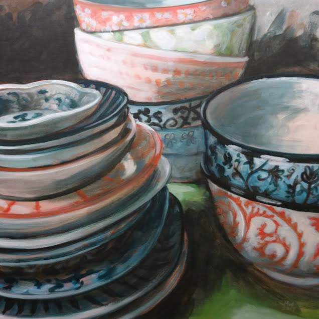 Michelle Wiebe "Spires" 20" x 20" Acrylic on Canvas This is a tough time of year to tackle studio projects. That being said, I'm pleased with this piece - especially knowing how hard I had to fight to get long uninterrupted stretches required to do such a technical piece. I think it was worth the fight.
It felt so good to work larger than my usual 10" x 10" sized canvas. Bigger brushes, larger swaths of colour, forced simplification and room to get into detail if I wanted too. Lots of breathing room on this canvas so I tried to capture that, especially in the background, with loose and airy brushstrokes to help tell that story. Lately, life has felt complex - I think that has come out in the subject here. It feels like sometimes I am better at articulating visually than with words. An alternate title for this piece was "Hint of Lime" because of the peeks of green you can see throughout. However, I think those types of titles are better suited to fun little painting studies than to big pieces like this. I went with "Spires" because I think it better suits all that is going on here. Hope it translates. 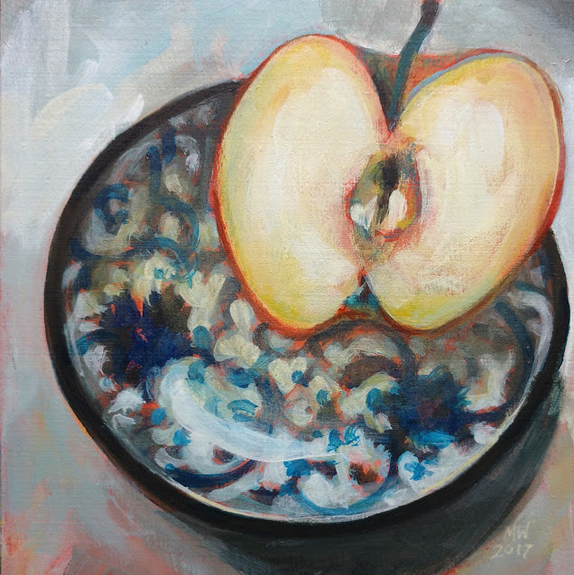 Michelle Wiebe "Crisp and Sweet" 6" x 6" Acrylic on Board Okay, confession time. I ate my subject before I finished this piece. It really was as crisp and as sweet as the title suggests. I have so much fruit in my kitchen right now as a result of this little series of acrylic on cradled panel paintings. I am definitely getting my daily quota of fresh fruit this season!
This week has be very productive, might be a few days till I can post another of these little still life paintings. I have an exciting public art project in the next few days that I'll save for another post. In the meantime though, I was happy I got an early start today in the studio so I could finish this piece. 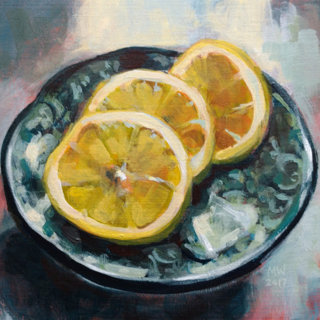 Michelle Wiebe "Citrus on Blue" 6" x 6" Acrylic on Board Another little 6" x 6" completed painting. I think I've figured out what has captured my heart with these pieces lately - I'm having so much fun trying to paint these new patterns without actually painting the patterns.
One thing about a small space like this to work on is you are forced to prioritize and simplify. To actually depict these patterns in their entirety would require a 000 brush and infinite patience. The outcome would probably be stiff and stilted as well. Instead, by focusing on the impression of the pattern, it gives the viewer a chance to participate in the experience by letting their imaginations fill in the blanks. It's neat when painter and viewer can engage in this dance. 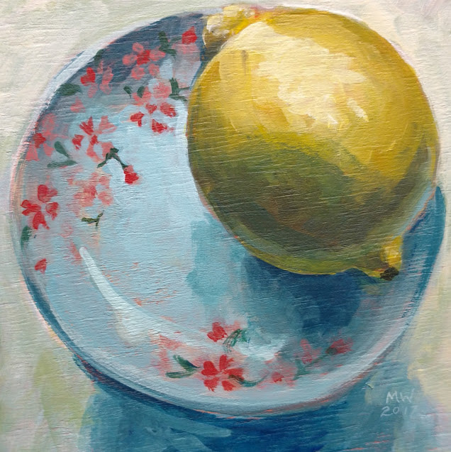 Michelle Wiebe Sweet and Sour 6" x 6" Acrylic on Board Half the fun of these little plate paintings if for me to have a chance to really stop and look at what I am painting. I chose this plate because I love hand painted floral patterns an I wanted something with reds and pinks. It wasn't until I started painting that I realized that the little flowers were made up of cute little hearts. Observing what makes up a pattern really makes me appreciate the artisan's hands that drew the plate design.
This was another piece where the name just came to me. It is those sweet little red hearts against the sour lemon - Sweet and Sour. It is another tiny 6" x 6" acrylic on cradled panel piece. 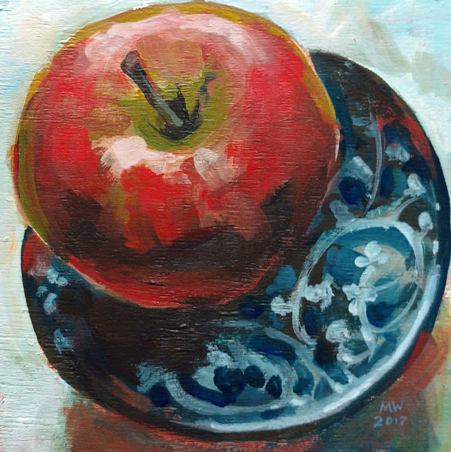 This little cradled panel is so tiny and sweet! It measures 6" x 6" and is part of a little series of individual plate and fruit still life paintings I'm working on. I want to concentrate on these new patterns to get familiar (and honestly just enjoy each one in it's own right) but I also want to focus on keeping things fresh and loose. It was a joy to move fast and free while I was creating this!
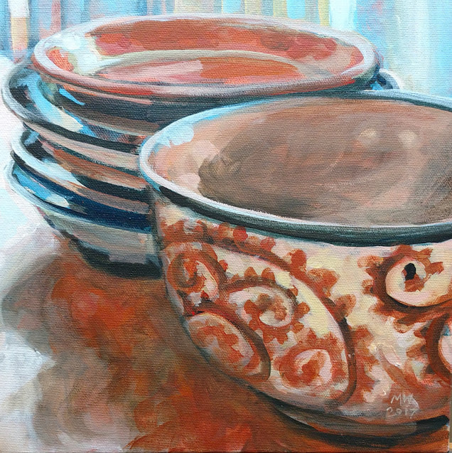 Michelle Wiebe Burnished Glow 10" x 10" Acrylic on Canvas For a few weeks, I have had stacks of new bowls and plates in my studio. When I'm in the middle of a project and trying to think, I sort these into new arrangements until something catches my eye. In this particular set up, it was the juxtaposition of the icy cold, late afternoon light against the warm rusty reds of the shadows cast by the objects. Winter has very much arrived in the Foothills and I feel this painting reflects the warmth and coziness of my studio perfectly.
On a side note, it has been tough for me to get in the studio this week. I've had a number of pressing deadlines that are for future endeavors mixed with a wobbly, sick dog. I felt really blocked for painting, which is unusual for me. Today it was so good to put on a cup of tea, play music and just paint. I find when I have too much on my mind I feel creatively scattered. If I'm not creating and making stuff, I feel stifled. Definitely left the studio feeling much happier than when I entered. Also - my Card Making class at Leighton has been moved to a later date! There is still room to sign up, Just follow the links below! Leighton Art Centre, Calgary: Classic Holiday Cardmaking Workshop New Date! Sat, December 9th, 10:00 AM to 4:00 PM Supplies included Cost: $85.00 (Leighton Members receive a 10% discount) Make the Holidays extra special by printing your own Christmas cards! Join Michelle Wiebe as she guides students through some simple printmaking techniques. In this fun, fast paces class students will learn basic linocutting skills to make their own Christmas themed blocks that they can keep to make other great gifts and cards. Participants will cut blocks, learn some special embellishment tricks and hand print their own set of Christmas cards to take home. Excellent for adults and teenagers who are beginner and intermediate linocut students. Space is limited and registration is required. Please visit Leighton Art Centre or contact them at workshops@leightoncentre.org to register.  This image was originally posted to my instagram feed and chosen as the #yyclcl photo of the month! How cool is this? Calgary Arts Development contacted me this week wanting to feature the above photograph for their Calgary Living a Creative Life series! They also asked me to share some thoughts on how I live a creative life. This is the article in it's entirety here.
What a neat surprise to have happen this week! The creative team over at CAD was great to work with too - thanks guys! 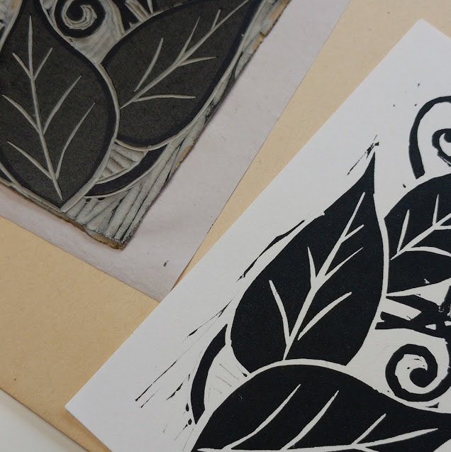 A recent print I pulled using a sample of linoleum flooring material. The short answer is yes, you can print using linoleum flooring. While they are very similar, I found there were some differences to this material from artist grade linoleum. Recently, my sister (who works for a flooring company), gave me some samples of discontinued linoleum flooring to try. On initial inspection, they looked almost identical to battleship grey artist grade lino. 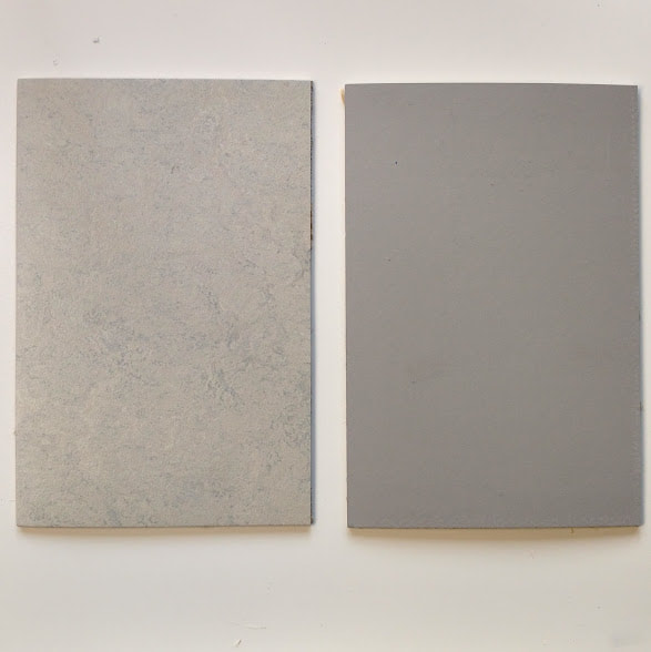 On the left is flooring, on the right is artist linoleum. I cut the sample to the same size for easy comparison. To touch, I found that the flooring was more pliable and had a very, very slight texture to the cutting surface. I did not sand this sample down, because I wanted a baseline test to see what out-of-the-box lino would be like to work with. In future tests though, I will take a very fine grit sandpaper to the surface to reduce this. It almost feels like a surface coating. 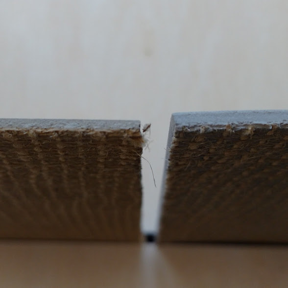 As you can see, both are hessian backed but the flooring on the left is a slight bit thinner. If you were to use this for letterpress, you would need to keep that in mind to achieve a type high block Cutting the flooring was a pleasure. I honestly breezed through the entire sample. It was somewhere between a soft block and standard artist grade. It held the tool well without me feeling like I had to force anything. The line quality was decent. One thing I noticed though was hit the bottom layer very easily (making for a not as pretty block) Since it is a thinner material, there is a finer layer of the linoleum surface on the hessian. 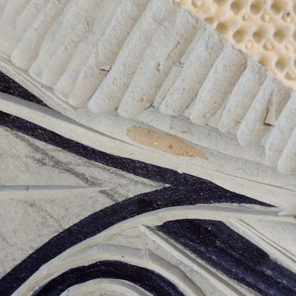 Interestingly, although it is very similar in composition to an artist grade block, the surface layer is noticeably thinner and there seems to be a hard mdf type layer in between it and the hessian backing. I don't think it dulled my tools when I hit it though. Once I got to inking the piece, I noticed the surface texture a lot more. It is very smooth but minutely pebble like to touch. When I rolled the brayer of oil based ink on it, I noticed it didn't drink it up quite the same way as the first layer of ink on artist grade linoleum. 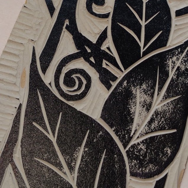 This is the block when I first applied ink, as you can see, there is a pebble like texture to the ink sitting on the surface. I let it sit for a moment to soak in, applied another coat of ink and then proceeded to print. After a few proof prints, it printed almost identically for for the first 10 prints or so. I achieved nice inky, deep blacks and crisp lines with the usual amount of effort. As an aside, I pull prints with the help of an antique book press, so I don't know if hand burnishing would get the same results. 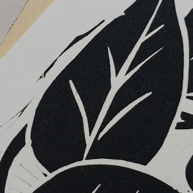 This was a proof print, I cleaned all that chatter up before starting my edition. I found after about 10 prints, I started fighting an odd resistance to the ink. I noticed my edges were fuzzing out a little here and there and had a closer look at the block. I appeared to be that the all the cut lines were pushing back the ink. I blotted the block when I noticed this happening and it seem to alleviate the issue for a few prints but it always came back. I'm pretty sure sanding the coating off the top layer is the way to fix this issue. 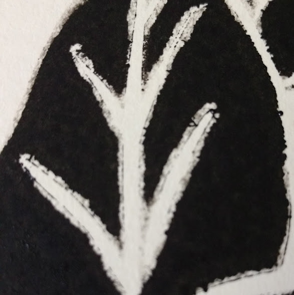 This is a print with the fuzzing issue I noticed. It was like the oil based ink was resisting the cut lines. All in all, I will keep experimenting on this, for sure. I really like how it carved and I like the fact that if I wanted a bigger piece to work on, this would be an economical way to get materials. I'm not worried about the "artist grade" part of this on a conservation level because the time span that a block is in use is so short and the contact with things that need to be artist grade (ink and paper) is very brief, it wouldn't have much of an effect. Remember, flooring is where linocut printmaking all began in the Die Brucke movement... it was a cheap, easily sourced alternative to woodcut blocks.
Stay tuned for the reveal of the print I made with this block! I'm not quite done with it yet.  Michelle Wiebe Pink Slice 10" x 10" Acrylic on Canvas I love it when the theme of a picture just sorts itself out for you. I've been playing with plate composition all week in the studio with my new treasures. Stacking, re-stacking, moving to a different light - its been an undercurrent of activity and thought while I putter away on other projects.
Once and a while, I'll snap a picture or two of a pleasing arrangement and sort the images out later. When I was editing photos, this one leaped to the the forefront. Absolutely by chance, the shadows on the table and the bowl interior were in the same family as the rosy pink plate. What would have normally stuck out like a sore thumb (the lone pink plate) works in harmony here because of this. What fun to paint = I loved pushing that airy, precious pink into every corner of the canvas that I could fit it into! This painting is part of my submission for the Christmas in Country show at the Leighton Art Centre in a few weeks. You can read more about it here. |
AuthorMichelle Wiebe Categories
All
Archives
April 2024
|
 RSS Feed